Ulysses 20: The Dashboard
The newest feature in Ulysses may help me make the jump to using it for ALL of my writing.

Readers of the blog know that I’m a fan of Ulysses. While I’ve not yet transitioned my long-form fiction writing to Ulysses—I’m still a fan of Scrivener for that—the newest feature in Ulysses, the Dashboard, may help me to make that jump some day. (But not today…)
What I’m Looking Forward To
The Ulysses 20 Dashboard puts all relevant information about your text in one spot. In some ways, it’s not that different from the various sidebars that you could bring up in previous versions of Ulysses. I can access my progress (e.g., word counts and such), notes, keywords, and attachments. But now, I also have access to annotations (a feature I use extensively), links that I’ve used, as well as the structure/outline of my text.
(Maybe those were there before, but I don't remember them.)
Read on to learn about a couple of features that I’m looking forward to!
Overview
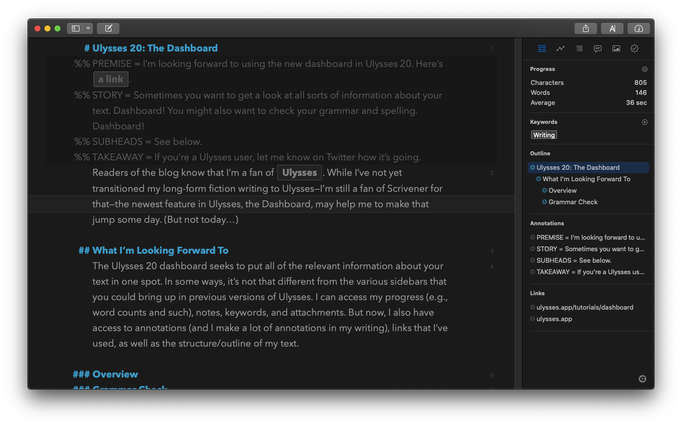
Here’s a screenshot of this text in progress. You can see the Dashboard Overview to the right.

When I write blog posts, I try to keep things highly structure, so I’m very interested in that outline view. Moreover, the Annotations section will offer me a quick peek at the big ideas that I’m trying to focus on.
(NOTE: I use Shaunta Grimes’s PSST framework for many of my posts. I put the Premise, the Story, the Subheads, and the Takeaway in an annotation at the beginning of a post so that I know exactly what I’m trying to do with this piece. If you’re interested in Ms. Grimes’s framework, see her article: “A Simple Framework for Capturing and Organizing Your Blog Post Ideas.”)
Additionally, as I write blog posts, I often provide my readers with links. Again, the Dashboard Overview is going to show me those links.
When I’m in draft mode, I typically keep things simple: I display my text in full screen. However, I may actually use this Dashboard Overview to help me keep track of where I am in my text, what I’m trying to do, and what I need to take care of before I can mark the draft ready for revision.
Grammar Check
The new Dashboard also features a built-in Grammar Check provided by LanguageTool. I’m not familiar with that particular app, but it’s already caught a few mistakes that I’ve made, so I’m happy for that!
When you engage the “Grammar Check,” it tones down the color of your Ulysses theme and then highlights the sections of the text that you need to look at. Even better, the suggestions list in the Dashboard is clickable, so you can simply click through the mistakes and evaluate whether you think LanguageTool has made the right call.
For this particular post, LanguageTool turned up a handful of mistakes, all of which needed correction. They fell into the following categories:
- Redundancy (flagging “whether or not” as redundant…changed that sentence to simply “whether”)
- Style (in this case, unnecessary passive voice)
- Grammar (a singular noun that should have been plural)
Small errors, but good, helpful fixes!
When we self-publish, we often don’t have the benefit of an editor or a second pair of eyes to line-edit our work. So often, I receive messages from readers about typos and other grammatical quibbles in my work. It will be helpful to have Ulysses catch these for me.
Get in Touch!
If you’re currently using Ulysses 20, let me know what you think about the Dashboard! Get in touch with me via Twitter.
If you're looking for more information about the Dashboard, here is Ulysses's official tutorial.
Happy writing!